Showing posts with label custom. Show all posts

AEM: Show/Hide Dialog Tab based on selection(checkbox, radio, select)

 Hello, Let's see how to Show/Hide coral3 Touch UI Dialog Tab based on a selection(checkbox, radio, select).

Let's get started

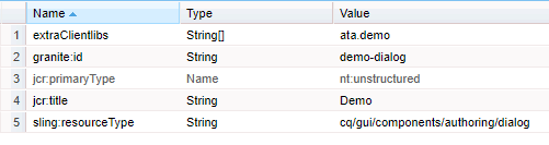
To achieve this we need to create a custom client library. I suggest not to use OOTB categories. To know how to create custom client library and configure it in dialog check out below link. Ignore if you already know.

See how to Create custom Touch Dialog UI edit client libraries

Now we know how to create the custom client library and we created, configured in our dialog.

Here I have a Demo Component and in the dialog I have 3 fields and Two Tabs as show in below image.

demo-dialog

I have added id to each of the tab as shown in below image to identify/get the tab in JavaScript.

tab-node


Show/Hide Tab on Checkbox selection

Here we have 2 text fields and a checkbox. Let us see to to show/hide the Tab Two based on checkbox(Hide Tab Two) selection.

Below is the node and properties for checkbox.

checkbox-node

Note:  It is recommended to set value, uncheckedValue properties. Check below documentation for checkbox.

https://helpx.adobe.com/experience-manager/6-5/sites/developing/using/reference-materials/granite-ui/api/jcr_root/libs/granite/ui/components/coral/foundation/form/checkbox/index.html

We have listener.js file in our custom client library that we created, let us open that.

listener.js

Let's add a self executable function, inside that add dialog ready event.

(function ($, document, ns) {

    $(document).on("dialog-ready", function() {

    });

})(Granite.$, document, Granite.author);

 The dialog ready event listener(or call back) will be fired once dialog is ready.

Now let's write a change event listener for checkbox in side dialog ready.

(function ($, document, ns) {
    $(document).on("dialog-ready", function() {
const showHideTab = function(e) {
            const tabTwo = $(".coral3-Tab[aria-controls='"+$("#tab-two").closest(".coral3-Panel").attr("id")+"']");
            if($("[name='./hide-tab']:checked").val() == "hide") {
                tabTwo.hide();
            } else {
                tabTwo.show();
            }
        };
$(document).on("change", "[name='./hide-tab']", showHideTab);
showHideTab();
    });
})(Granite.$, document, Granite.author);

Note: The highlighted name should be updated

Now Save the changes and hard reload the page and open the dialog.

Check and un-check the checkbox and you can see the Tab Two is hiding and showing upon selection.

final-dialog-checkbox


Show/Hide Tab on Radio button selection

Here I have two text fields, radio group and two tabs. Let's see how to hide/show Tab based on radio selection.

Below is the node and properties of radio group.

radiogroup-node

Now update the listener.js.

listener.js

(function ($, document, ns) {
    $(document).on("dialog-ready", function() {
const showHideTab = function(e) {
            const tabTwo = $(".coral3-Tab[aria-controls='"+$("#tab-two").closest(".coral3-Panel").attr("id")+"']");
            if($("[name='./hide-tabtwo']:checked").val() == "hide") {
                tabTwo.hide();
            } else {
                tabTwo.show();
            }
        };
$(document).on("change", "[name='./hide-tabtwo']", showHideTab);
showHideTab();
    });
})(Granite.$, document, Granite.author);

Note: The highlighted name should be updated. 

Now Save the changes and hard reload the page and open the dialog.

Change the radio options and you can see the Tab Two is hiding and showing upon selection.

final-dialog-radio


Show/Hide Tab on Dropdown(select) selection

Here I have two text fields, dropdown and two tabs. Let's see how to hide/show Tab based on dropdown selection.

dialog-select


Below is the node and properties of dropdown.

select-node

Now update the listener.js.

listener.js

(function ($, document, ns) {
    $(document).on("dialog-ready", function() {

        const showHideTab = function () {
            const tabTwo = $(".coral3-Tab[aria-controls='"+$("#tab-two").closest(".coral3-Panel").attr("id")+"']");
            if ($(".cq-dialog").find("#hidetab")[0].selectedItem.value === "hide") {
tabTwo.hide();
            } else {
tabTwo.show();
            }
        };


       $(".cq-dialog").find("#hidetab").on("change", showHideTab);
        showHideTab();
    });
})(Granite.$, document, Granite.author);

Note: The highlighted name should be updated. 

Now Save the changes and hard reload the page and open the dialog.

Change the dropdown options and you can see the Tab Two is hiding and showing upon selection.

final-dialog-select

Hurrah.... We have successfully achieved  the hide and show functionality based on selection of checkbox, radio and select options.

Hope you liked the post and it helped you. Meet you in next post. Thank you very much for your time.

-AG  

AEM: Hide/Show Touch UI dialog fields based on radio selection

  Hello, I observed a lot of people asking the same question or similar kind of, How to Hide/Show field based on selection.

In my previous post we have seen how to achieve the same thing on checkbox selection. Check the below link.

See how to Hide/Show Touch UI dialog fields based on checkbox selection 

Now we will see how to achieve the same thing using radio button.

Let's get started

In order to achieve this we need to create our own custom client library. I suggest not to use OOTB categories. To know how to create custom client library and configure it in dialog check out below link. Ignore if you already know.

See how to Create custom Touch Dialog UI edit client libraries

Now we know how to create the custom client library and we created and configured in our dialog.

Here I have a Demo Component and in the dialog I have 3 fields as show in below image.

demo-dialog

Here I have two text fields and one radio group. Let's see how to hide/show the text field based on radio selection.

Below is the node and properties of radio group.

radio-group

We have created listerner.js file as part of our custom client library, let's open that.

listener.js

Let's add a self executable function, inside that add dialog ready event.

(function ($, document, ns) {

    $(document).on("dialog-ready", function() {

    });

})(Granite.$, document, Granite.author);

 The dialog ready event listener(or call back) will be fired once dialog is ready.

Now let's write a change event listener for radio buttons in side dialog ready.

(function ($, document, ns) {
    $(document).on("dialog-ready", function() {
const showHideSubTitle = function(e) {
            if($("[name='./hide-subtitle']:checked").val() == "hide") {
                $("input[name='./sub-title']").closest(".coral-Form-fieldwrapper").hide();
            } else {
                $("input[name='./sub-title']").closest(".coral-Form-fieldwrapper").show();
            }
        };
$(document).on("change", "[name='./hide-subtitle']", showHideSubTitle);
showHideSubTitle();
    });
})(Granite.$, document, Granite.author);

Note: The highlighted name should be updated. 

Now Save the changes and hard reload the page and open the dialog.

Change the radio options and you can see the sub-title field is hiding and showing upon selection.

dialog-final


Hurrah.... We have successfully achieved  the hide and show functionality based on radio button selection.

Hope you liked the post and it helped you. Meet you in next post. Thank you very much for your time.

-AG  

AEM: Create custom Touch Dialog UI edit client libraries

Hello, Let us see how to create a client library for Touch UI Dialog listeners.

It is always recommended to use custom clientlib category instead of using OOTB  categories.

Why we need to create a custom clientlib?

If we use the OOTB categories there are chances of embedding our listener code in to the framework JavaScript and it will be included in all pages all the time.

If there is any Error in our code, it will break the entire framework and EDIT mode will be hanged sometimes.

So it is always better to create our custom client library and include it in our dialog. This way it will be loaded on the page only when we open the dialog at least once.

Creating Client Library

We can create a Client Library Folder in any location under apps or etc/designs. But I personally prefer creating Client Libraries which are specific to Edit mode/Dialog under component node itself.

Let's create Client Library. 

  1. Create a folder clientlibs(sling:Folder) under component node (parellel to cq:dialog)
  2. Create a folder editor(cq:clientLibraryFolder) under clientlibs and added property categories String[] <category_name> (Must be same as value configured in dialog node)
  3. Create a folder js(nt:folder) and create a file listener.js inside it
  4. Create a file js.txt parallel to js folder and add #base=js listener.js (in two different lines)
  5. Save changes
client-lib

                                                                      js.txt file


Now we are done with creating the cilentlib. Let us configure it in our dialog.

There are two ways to load clientlib from dialog.

  1. Set a property extraClientlibs to cq:dialog node and add category as value
  2. Create node(nt:unstructured) and use granite/ui/components/coral/foundation/includeclientlibs

1.Using extraClientlibs

Add a property extraClientlibs (String[]) to cq:dialog node and add custom clientlib category.


2. Using granite/ui/components/coral/foundation/includeclientlibs

  • Create a node with name clientlibs under tab/items
  • Add property sling:resourceType (String) with value granite/ui/components/coral/foundation/includeclientlibs
  • Add property js (String) with custom clientlib category as value

Note: granite/ui/components/coral/foundation/includeclientlibs supports three properties js/css/categories. Here I am using only js.


Now we created our own custom clientlib and configured it in dialog. 

Open the listener.js file and start writing custom listener code with out using OOTB categories. 🙌

See how to Hide/Show Touch UI dialog fields based on checkbox selection

See how to AEM: Hide/Show Touch UI dialog fields based on radio selection

Hope you liked the post and it helped. Meet you in next post. Thank you very much for your time.

-AG