Showing posts with label AEM. Show all posts

AEM: Show/Hide Dialog Tab based on selection(checkbox, radio, select)

 Hello, Let's see how to Show/Hide coral3 Touch UI Dialog Tab based on a selection(checkbox, radio, select).

Let's get started

To achieve this we need to create a custom client library. I suggest not to use OOTB categories. To know how to create custom client library and configure it in dialog check out below link. Ignore if you already know.

See how to Create custom Touch Dialog UI edit client libraries

Now we know how to create the custom client library and we created, configured in our dialog.

Here I have a Demo Component and in the dialog I have 3 fields and Two Tabs as show in below image.

demo-dialog

I have added id to each of the tab as shown in below image to identify/get the tab in JavaScript.

tab-node


Show/Hide Tab on Checkbox selection

Here we have 2 text fields and a checkbox. Let us see to to show/hide the Tab Two based on checkbox(Hide Tab Two) selection.

Below is the node and properties for checkbox.

checkbox-node

Note:  It is recommended to set value, uncheckedValue properties. Check below documentation for checkbox.

https://helpx.adobe.com/experience-manager/6-5/sites/developing/using/reference-materials/granite-ui/api/jcr_root/libs/granite/ui/components/coral/foundation/form/checkbox/index.html

We have listener.js file in our custom client library that we created, let us open that.

listener.js

Let's add a self executable function, inside that add dialog ready event.

(function ($, document, ns) {

    $(document).on("dialog-ready", function() {

    });

})(Granite.$, document, Granite.author);

 The dialog ready event listener(or call back) will be fired once dialog is ready.

Now let's write a change event listener for checkbox in side dialog ready.

(function ($, document, ns) {
    $(document).on("dialog-ready", function() {
const showHideTab = function(e) {
            const tabTwo = $(".coral3-Tab[aria-controls='"+$("#tab-two").closest(".coral3-Panel").attr("id")+"']");
            if($("[name='./hide-tab']:checked").val() == "hide") {
                tabTwo.hide();
            } else {
                tabTwo.show();
            }
        };
$(document).on("change", "[name='./hide-tab']", showHideTab);
showHideTab();
    });
})(Granite.$, document, Granite.author);

Note: The highlighted name should be updated

Now Save the changes and hard reload the page and open the dialog.

Check and un-check the checkbox and you can see the Tab Two is hiding and showing upon selection.

final-dialog-checkbox


Show/Hide Tab on Radio button selection

Here I have two text fields, radio group and two tabs. Let's see how to hide/show Tab based on radio selection.

Below is the node and properties of radio group.

radiogroup-node

Now update the listener.js.

listener.js

(function ($, document, ns) {
    $(document).on("dialog-ready", function() {
const showHideTab = function(e) {
            const tabTwo = $(".coral3-Tab[aria-controls='"+$("#tab-two").closest(".coral3-Panel").attr("id")+"']");
            if($("[name='./hide-tabtwo']:checked").val() == "hide") {
                tabTwo.hide();
            } else {
                tabTwo.show();
            }
        };
$(document).on("change", "[name='./hide-tabtwo']", showHideTab);
showHideTab();
    });
})(Granite.$, document, Granite.author);

Note: The highlighted name should be updated. 

Now Save the changes and hard reload the page and open the dialog.

Change the radio options and you can see the Tab Two is hiding and showing upon selection.

final-dialog-radio


Show/Hide Tab on Dropdown(select) selection

Here I have two text fields, dropdown and two tabs. Let's see how to hide/show Tab based on dropdown selection.

dialog-select


Below is the node and properties of dropdown.

select-node

Now update the listener.js.

listener.js

(function ($, document, ns) {
    $(document).on("dialog-ready", function() {

        const showHideTab = function () {
            const tabTwo = $(".coral3-Tab[aria-controls='"+$("#tab-two").closest(".coral3-Panel").attr("id")+"']");
            if ($(".cq-dialog").find("#hidetab")[0].selectedItem.value === "hide") {
tabTwo.hide();
            } else {
tabTwo.show();
            }
        };


       $(".cq-dialog").find("#hidetab").on("change", showHideTab);
        showHideTab();
    });
})(Granite.$, document, Granite.author);

Note: The highlighted name should be updated. 

Now Save the changes and hard reload the page and open the dialog.

Change the dropdown options and you can see the Tab Two is hiding and showing upon selection.

final-dialog-select

Hurrah.... We have successfully achieved  the hide and show functionality based on selection of checkbox, radio and select options.

Hope you liked the post and it helped you. Meet you in next post. Thank you very much for your time.

-AG  

AEM: Hide/Show Touch UI dialog fields based on radio selection

  Hello, I observed a lot of people asking the same question or similar kind of, How to Hide/Show field based on selection.

In my previous post we have seen how to achieve the same thing on checkbox selection. Check the below link.

See how to Hide/Show Touch UI dialog fields based on checkbox selection 

Now we will see how to achieve the same thing using radio button.

Let's get started

In order to achieve this we need to create our own custom client library. I suggest not to use OOTB categories. To know how to create custom client library and configure it in dialog check out below link. Ignore if you already know.

See how to Create custom Touch Dialog UI edit client libraries

Now we know how to create the custom client library and we created and configured in our dialog.

Here I have a Demo Component and in the dialog I have 3 fields as show in below image.

demo-dialog

Here I have two text fields and one radio group. Let's see how to hide/show the text field based on radio selection.

Below is the node and properties of radio group.

radio-group

We have created listerner.js file as part of our custom client library, let's open that.

listener.js

Let's add a self executable function, inside that add dialog ready event.

(function ($, document, ns) {

    $(document).on("dialog-ready", function() {

    });

})(Granite.$, document, Granite.author);

 The dialog ready event listener(or call back) will be fired once dialog is ready.

Now let's write a change event listener for radio buttons in side dialog ready.

(function ($, document, ns) {
    $(document).on("dialog-ready", function() {
const showHideSubTitle = function(e) {
            if($("[name='./hide-subtitle']:checked").val() == "hide") {
                $("input[name='./sub-title']").closest(".coral-Form-fieldwrapper").hide();
            } else {
                $("input[name='./sub-title']").closest(".coral-Form-fieldwrapper").show();
            }
        };
$(document).on("change", "[name='./hide-subtitle']", showHideSubTitle);
showHideSubTitle();
    });
})(Granite.$, document, Granite.author);

Note: The highlighted name should be updated. 

Now Save the changes and hard reload the page and open the dialog.

Change the radio options and you can see the sub-title field is hiding and showing upon selection.

dialog-final


Hurrah.... We have successfully achieved  the hide and show functionality based on radio button selection.

Hope you liked the post and it helped you. Meet you in next post. Thank you very much for your time.

-AG  

AEM: Hide/Show Touch UI dialog fields based on checkbox selection

 Hello, I observed a lot of people asking the same question or similar kind of, How to Hide/Show field based on selection.

Just not to over load this post, here we will see how to Show/Hide fields based on checkbox selection in this post and in next post we will see how to achieve the same thing on radio button selection.

See how to AEM: Hide/Show Touch UI dialog fields based on radio selection

Let's get started


In order to achieve this we need to create our own custom client library. I suggest not to use OOTB categories. To know how to create custom client library and configure it in dialog check out below link. Ignore if you already know.

See how to Create custom Touch Dialog UI edit client libraries

Now we know how to create the custom client library and we created and configured in our dialog.

Here I have a Demo Component and in the dialog I have 3 fields as show in below image.

demo-dialog

Here we have 2 text fields and a checkbox. Let us see to to show/hide the Sub Title field based on checkbox(Hide Sub Title) selection.

Below is the node and properties for checkbox.

hide-subtitle

Note:  It is recommended to set value, uncheckedValue properties. Check below documentation for checkbox.

https://helpx.adobe.com/experience-manager/6-5/sites/developing/using/reference-materials/granite-ui/api/jcr_root/libs/granite/ui/components/coral/foundation/form/checkbox/index.html

We have listener.js file in our custom client library that we created, let us open that.

listener.js

Let's add a self executable function, inside that add dialog ready event.

(function ($, document, ns) {

    $(document).on("dialog-ready", function() {

    });

})(Granite.$, document, Granite.author);

 The dialog ready event listener(or call back) will be fired once dialog is ready.

Now let's write a change event listener for checkbox in side dialog ready.

(function ($, document, ns) {
    $(document).on("dialog-ready", function() {
const showHideSubTitle = function(e) {
            if($("[name='./hide-subtitle']").prop("checked")) {
                $("input[name='./sub-title']").closest(".coral-Form-fieldwrapper").hide();
            } else {
                $("input[name='./sub-title']").closest(".coral-Form-fieldwrapper").show();
            }
        };
$(document).on("change", "[name='./hide-subtitle']", showHideSubTitle);
showHideSubTitle();
    });
})(Granite.$, document, Granite.author);

Note: The highlighted name should be updated. 

Now Save the changes and hard reload the page and open the dialog.

Check and un-check the checkbox and you can see the sub-title field is hiding and showing upon selection.

subtitle-hide
Hurrah.... We have successfully achieved  the hide and show functionality based on checkbox selection.

Hope you liked the post and it helped you. Meet you in next post. Thank you very much for your time.

-AG  


AEM: Create custom Touch Dialog UI edit client libraries

Hello, Let us see how to create a client library for Touch UI Dialog listeners.

It is always recommended to use custom clientlib category instead of using OOTB  categories.

Why we need to create a custom clientlib?

If we use the OOTB categories there are chances of embedding our listener code in to the framework JavaScript and it will be included in all pages all the time.

If there is any Error in our code, it will break the entire framework and EDIT mode will be hanged sometimes.

So it is always better to create our custom client library and include it in our dialog. This way it will be loaded on the page only when we open the dialog at least once.

Creating Client Library

We can create a Client Library Folder in any location under apps or etc/designs. But I personally prefer creating Client Libraries which are specific to Edit mode/Dialog under component node itself.

Let's create Client Library. 

  1. Create a folder clientlibs(sling:Folder) under component node (parellel to cq:dialog)
  2. Create a folder editor(cq:clientLibraryFolder) under clientlibs and added property categories String[] <category_name> (Must be same as value configured in dialog node)
  3. Create a folder js(nt:folder) and create a file listener.js inside it
  4. Create a file js.txt parallel to js folder and add #base=js listener.js (in two different lines)
  5. Save changes
client-lib

                                                                      js.txt file


Now we are done with creating the cilentlib. Let us configure it in our dialog.

There are two ways to load clientlib from dialog.

  1. Set a property extraClientlibs to cq:dialog node and add category as value
  2. Create node(nt:unstructured) and use granite/ui/components/coral/foundation/includeclientlibs

1.Using extraClientlibs

Add a property extraClientlibs (String[]) to cq:dialog node and add custom clientlib category.


2. Using granite/ui/components/coral/foundation/includeclientlibs

  • Create a node with name clientlibs under tab/items
  • Add property sling:resourceType (String) with value granite/ui/components/coral/foundation/includeclientlibs
  • Add property js (String) with custom clientlib category as value

Note: granite/ui/components/coral/foundation/includeclientlibs supports three properties js/css/categories. Here I am using only js.


Now we created our own custom clientlib and configured it in dialog. 

Open the listener.js file and start writing custom listener code with out using OOTB categories. 🙌

See how to Hide/Show Touch UI dialog fields based on checkbox selection

See how to AEM: Hide/Show Touch UI dialog fields based on radio selection

Hope you liked the post and it helped. Meet you in next post. Thank you very much for your time.

-AG


AEM: Create Coral3 Touch UI dropdown from JSON file (JSP)


Hello, Let us see how to create a dropdown values using JSON file which is inside DAM. I am going to explain how to achieve this using JSP file.


Use case:

In some cases authors or business might want to add or remove values from dropdown of a authoring dialog. A JSON file inside DAM will be easy for authors to update whenever required without a Developer intervention. 


Why JSP?

  • We know that the JSP is internally a Servlet. 
  • As JSP file will be as part of our component code base, it is very is easy to update. 
  • The usage of this JSP file is only as part Dialog/Edit mode.

Implementation:

I have created a Demo Component which is having a Language dropdown inside authoring dialog.


initial-dialog

Below is the node structure.


select-node

Now instead of creating options nodes under items, we will create a data source node under the coral select field.

  • Create a node under select field with name datasource type nt:unstructured
  • Add sling:resourceType property and give datasource(JSP) path (yet to create)

datasource-node

Now let us create a folder(nt:folder) with same path as we configured in datasource node. Create a file(language.jsp) under the folder.

Here I have created a folder under my project/component folder with name datasource and inside that I have created a folder with name language similar to the path I have specified in datasource node.

Under language folder I have created a jsp file with name language.jsp (jsp file name and folder name must be same).

datasource-file

Now let us create and upload a JSON file in DAM

 Here in this example I have created a JSON file(language.json) with different languages like below and uploaded in DAM.

[
  {
    "value": "arabic",
    "text": "Arabic"
  },
  {
    "value": "chinese",
    "text": "Chinese"
  },
  {
    "value": "dutch",
    "text": "Dutch"
  },
  {
    "value": "english",
    "text": "English"
  },
  {
    "value": "french",
    "text": "French"
  },
  {
    "value": "german",
    "text": "German"
  },
  {
    "value": "italian",
    "text": "Italian"
  },
  {
    "value": "japanese",
    "text": "Japanese"
  },
  {
    "value": "russian",
    "text": "Russian"
  }
]

Logic to read JSON file and add options to select(dropdown)

Now inside the jsp file add the below code to read JSON file and add options to select field.

<%@page session="false" 
import="org.apache.sling.api.resource.Resource,
        org.apache.sling.api.resource.ValueMap,
        org.apache.sling.api.resource.ResourceMetadata,
        org.apache.sling.api.wrappers.ValueMapDecorator,
    org.json.simple.parser.JSONParser,
        com.adobe.granite.ui.components.ds.DataSource,
        com.adobe.granite.ui.components.ds.SimpleDataSource,
        com.adobe.granite.ui.components.ds.ValueMapResource"%>

<%@taglib prefix="cq" uri="http://www.day.com/taglibs/cq/1.0" %>
<cq:defineObjects/>

<%
            
Resource jsonResource = resourceResolver.getResource("/content/dam/adapttoaem/dialog/json/language.json/jcr:content/renditions/original/jcr:content");

if (jsonResource != null) {
java.io.InputStream stream = jsonResource.adaptTo(javax.jcr.Node.class).getProperty("jcr:data").getBinary().getStream();
org.json.simple.JSONArray jsonArray =  (org.json.simple.JSONArray) new JSONParser().parse(new java.io.InputStreamReader(stream));
java.util.Iterator<org.json.simple.JSONObject> jsonObjectIterator = jsonArray.iterator();
//ArrayList to hold data
java.util.List<Resource> resourceList = new java.util.ArrayList<Resource>();
String text = "", value = "";
while(jsonObjectIterator.hasNext()){
org.json.simple.JSONObject eachJsonObject = jsonObjectIterator.next();
value = (String)eachJsonObject.get("value");
text = (String)eachJsonObject.get("text") ;

//populate the map
ValueMap vm = new ValueMapDecorator(new java.util.HashMap<String, Object>());
vm.put("value",value);
vm.put("text",text);

resourceList.add(new ValueMapResource(resourceResolver, new ResourceMetadata(), "nt:unstructured", vm));
}
//Create a DataSource that is used to populate the drop-down control
request.setAttribute(DataSource.class.getName(), new SimpleDataSource(resourceList.iterator()));
}
%>

Highlighted (in yellow color)  path in above code is the JSON file which we dropped inside DAM.

Here I am using json-simple bundle to parse the InputStream in to JSON Array. Below is the maven dependency and link(can directly download and install in Felix Console).

<dependency>
    <groupId>com.googlecode.json-simple</groupId>
    <artifactId>json-simple</artifactId>
    <version>1.1.1</version>
</dependency>

https://mvnrepository.com/artifact/com.googlecode.json-simple/json-simple/1.1.1

Output:

Now lets create a page and drop our Demo component and open the dialog.


ta-da


final-dialog


Hurrah.... Here we go, all the values are populated inside the dropdown.

Hope you liked the post and it helped. Meet you in next post. Thank you very much for your time.

See how to Create a dynamic dropdown(Javascript) based on value of other dropdown


-AG

AEM: Error: java.nio.file.FileSystemException .\dispatcher\.\enabled_vhosts\..vhost:

Hello, Lets see how to fix common issue that we face while creating an AEM project using archetype 24 with Dispatcher Configuration.

Maven Command:

mvn -B archetype:generate -D archetypeGroupId=com.adobe.aem -D archetypeArtifactId=aem-project-archetype -D archetypeVersion=24 -D appTitle="Project Title" -D appId="yourappid" -D groupId="com.xxxx.xxxx" -D aemVersion=version -D includeDispatcherConfig=y

Error:

[INFO] BUILD FAILURE

[ERROR] Failed to execute goal org.apache.maven.plugins:maven-archetype-plugin:3.2.0:generate (default-cli) on project standalone-pom: java.nio.file.FileSystemException: C:\..\..\..\dispatcher\src\conf.d\enabled_vhosts\xxx_publish.vhost: A required privilege is not held by the client. -> [Help 1]

[ERROR] To see the full stack trace of the errors, re-run Maven with the -e switch.

[ERROR] Re-run Maven using the -X switch to enable full debug logging.

[ERROR] For more information about the errors and possible solutions, please read the following articles:

[ERROR] [Help 1] http://cwiki.apache.org/confluence/display/MAVEN/MojoFailureException


Fix: Run the command prompt as Administrator and then run Maven command.

Meet you in next post. Thank you for your time.

AG

AEM: Create a dynamic dropdown(Javascript) based on value of other dropdown

Hello, Let us see how to create a dynamic dropdown options based on value of another dropdown.

Use Case: 

In some cases we might need to generate a dynamic dropdown options based on value of an another dropdown. Just like selecting a country  should change the cities list.

Implementation:

Create dialog fields:

I have demo component and there are two dropdowns inside that as part of authoring dialog. The first dropdown(Country) will have list of countries and the second dropdown(Cities) should have cities related to that particular country.

demo-dialog


 The first dropdown(Countries) has static options configured as nodes to select field. (Check out my post to generate dropdown from JSON file from backend JSP)

country-field


The second dropdown(Cities) does not have configured nodes under select field but the values will be populated through JavaScript.


cities-field


Now we are ready with the dialog. Lets create a JSON associated to Country field options.

Create a JSON file and upload in DAM:

I have five countries under my Country dropdown and the Name and Value for each dropdown option configured in node are as follows.

Country:

        "text": "Australia",
"value": "australia"
"text": "France",
"value": "france"
"text": "India",
"value": "india"
"text": "United Kingdom",
"value": "uk"
"text": "United States",
"value": "us"

Now lets create a cities.json file which will have City names associated to each Country option.

JSON file(cities.json)


{
   "australia":[
      {
         "text":"Sydney",
         "value":"sydney"
      },
      {
         "text":"Melbourne",
         "value":"melbourne"
      },
      {
         "text":"Perth",
         "value":"perth"
      },
      {
         "text":"Adelaide",
         "value":"adelaide"
      },
      {
         "text":"Brisbane",
         "value":"brisbane"
      }
   ],
   "france":[
      {
         "text":"Paris",
         "value":"paris"
      },
      {
         "text":"Marseille",
         "value":"marseille"
      },
      {
         "text":"Bordeaux",
         "value":"bordeaux"
      },
      {
         "text":"Strasbourg",
         "value":"strasbourg"
      },
      {
         "text":"Nantes",
         "value":"nantes"
      }
   ],
   "india":[
      {
         "text":"Mumbai",
         "value":"mumbai"
      },
      {
         "text":"Bengaluru",
         "value":"bengaluru"
      },
      {
         "text":"New Delhi",
         "value":"delhi"
      },
      {
         "text":"Hyderabad",
         "value":"hyderabad"
      },
      {
         "text":"Chennai",
         "value":"chennai"
      }
   ],
   "uk":[
      {
         "text":"London",
         "value":"london"
      },
      {
         "text":"Manchester",
         "value":"manchester"
      },
      {
         "text":"Edinburgh",
         "value":"edinburgh"
      },
      {
         "text":"Cambridge",
         "value":"cambridge"
      },
      {
         "text":"Leeds",
         "value":"leeds"
      }
   ],
   "us":[
      {
         "text":"New York",
         "value":"new-york"
      },
      {
         "text":"San Francisco",
         "value":"san-francisco"
      },
      {
         "text":"Los Angeles",
         "value":"los-angeles"
      },
      {
         "text":"Cambridge",
         "value":"cambridge"
      },
      {
         "text":"Washington, D.C.",
         "value":"washington-dc"
      }
   ]
}

Each keys in JSON file should exactly match with the values of each Country option.

Now upload this JSON file in DAM.

Dialog listener (JavaScript):

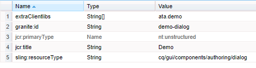
Now create a node under tab/items with name clientlibs and add below properties

sling:resourceType (String) granite/ui/components/coral/foundation/includeclientlibs 

js (String) <category_name>

clientlib-node


Now create a client library folder and write JavaScript.

I have created a folder under my component and inside that I created a client library folder.

  1. Create a folder clientlibs(sling:Folder) under component node (parellel to cq:dialog)
  2. Create a folder editor(cq:clientLibraryFolder) under clientlibs and added property categories String[] <category_name> (Must be same as value configured in dialog node)
  3. Create a folder js(nt:folder) and create a file listener.js inside it
  4. Create a file js.txt parallel to js folder and add #base=js listener.js (in two different lines)
  5. Save changes
clientlib-files

js.txt file

js.txt


Now lets start writing listener to populate the values in cities dropdown. Open listener.js and paste the below code.

Below is the listener to populate the dropdown fields. Here am using hardcoded options.

(function ($, document, ns) {
    $(document).on("dialog-ready", function() {
    // In dialog ready lets request the JSON and store it
        let citiesJSON;
$.ajax({
            url: "/content/dam/adapttoaem/dialog/json/cities.json", //Update the path
            async: false,
            success: function (data) {
                citiesJSON = data;
            }
        });

        const setCitiesOptions = function () {
            let citiesField = $(".cq-dialog").find("#cities")[0];
            let countryValue = $(".cq-dialog").find("#country")[0].selectedItem.value;
            let options = citiesJSON[countryValue];
            let optionItems = citiesField.items;
            optionItems.clear();
            for (var i = 0; i < options.length; i++) {
                let obj = new Object();
                let cnt = new Object();
                obj["value"] = options[i].value;
                cnt["textContent"] = options[i].text;
                obj["content"] = cnt;
                optionItems.add(obj);
            }
        };


       $(".cq-dialog").find("#country").on("change", setCitiesOptions);
        setCitiesOptions();
    });
})(Granite.$, document, Granite.author);

Now, Lets drop the component on page and open the dialog.

dailog-with-options

Yayy..... We see options loading in cities dropdown. Now try changing the Country options, Cities will also change accordingly.

Is that it?

Hmmm... No. 

Now let us select India from Country dropdown and then select New Delhi from cities and submit the dialog and re-open the dialog again.


dialog-reopen

oh-nooo


Let us fix this.

There are two ways to fix this.

  1. Getting the node value from backend(datasource) and use it in Javascript.
  2. Do an AJAX call to page/component path and get the node value and set the value.

It is not a best practice to do AJAX calls (here we are already getting JSON using AJAX call). If we can do this from backend why do we need to do one more AJAX call from frontend? Let go with backend datasource approach. 

Create a datasource for cities dropdown.

  • Create a node name - datasource, type - nt:unstructured under cities dropdown field.
  • Set property sling:resourceType and give a path datasource (same path as below).
  • Create a folder under your project ( here I'm using /apps/adapttoaem/components/datasource/cities).
  • Create a jsp file with name cities.jsp(parent folder name and file name must be same) inside /apps/adapttoaem/components/datasource/cities.
  • Add the blow code.
  • Save the changes

<%@page session="false" 
import="org.apache.sling.api.resource.Resource,
        org.apache.sling.api.resource.ValueMap,
        org.apache.sling.api.resource.ResourceMetadata,
        org.apache.sling.api.wrappers.ValueMapDecorator,
com.adobe.granite.ui.components.Field,
        com.adobe.granite.ui.components.ds.DataSource,
        com.adobe.granite.ui.components.ds.SimpleDataSource,
        com.adobe.granite.ui.components.ds.ValueMapResource"%>

<%@taglib prefix="cq" uri="http://www.day.com/taglibs/cq/1.0" %>
<cq:defineObjects/>

<%            
ValueMap fieldProps = (ValueMap)request.getAttribute(Field.class.getName());
String[] fieldVal = fieldProps.get("value", new String[0]);
String value = "";
if (fieldVal.length > 0) {
value = fieldVal[0];
}

ValueMap vm = new ValueMapDecorator(new java.util.HashMap<String, Object>());
vm.put("value", value);
//ArrayList to hold data
java.util.List<Resource> resourceList = new java.util.ArrayList<Resource>();
resourceList.add(new ValueMapResource(resourceResolver, new ResourceMetadata(), "nt:unstructured", vm));
//Create a DataSource that is used to populate the drop-down control
request.setAttribute(DataSource.class.getName(), new SimpleDataSource(resourceList.iterator()));
%>

Here in datasource jsp, we are setting the node value to dropdown field. Now we will update our listener JavaScript file and fetch the node(field) value before  injecting options.
Once options are injected, we will set the field value to dropdown field.

Now lets get back to our listener.js and finish the job.

Final listener.js code

(function ($, document, ns) {
    $(document).on("dialog-ready", function() {
    // In dialog ready lets request the JSON and store it
        let citiesJSON;
$.ajax({
            url: "/content/dam/adapttoaem/dialog/json/cities.json", //Update the path
            async: false,
            success: function (data) {
                citiesJSON = data;
            }
        });

        const setCitiesOptions = function () {
            let countryValue = $(".cq-dialog").find("#country")[0].selectedItem.value;
            let citiesField = $(".cq-dialog").find("#cities")[0];
            //Getting the value set from datasource
            let citiesNodeVal = citiesField.selectedItem.value;

            let options = citiesJSON[countryValue];
            let optionItems = citiesField.items;
            optionItems.clear();
            for (var i = 0; i < options.length; i++) {
                let obj = new Object();
                let cnt = new Object();
                obj["value"] = options[i].value;
                cnt["textContent"] = options[i].text;
                obj["content"] = cnt;
                optionItems.add(obj);
            }
            if (citiesNodeVal !== "") // Set the value once options are loaded 
        $(citiesField).find("coral-select-item[value='"+citiesNodeVal+"']").attr("selected", "selected");
        };


       $(".cq-dialog").find("#country").on("change", setCitiesOptions);
        setCitiesOptions();
    });
})(Granite.$, document, Granite.author);


Yesss.... Just Highlighted 3 lines of code. We are done.

Here in the above code, I am getting the value that we did set from datasource(First highlighted line). And once the options are injected then we are setting back the node value to the dropdown(Last two highlighted lines).

Now let's reload the page(hard refresh to make sure js is updated), open the dialog and check.


Ta-Da


final-dialog


Hurrah.... Here we go, the value has been set.

Hope you liked the post and it helped. Meet you in next post. Thank you very much for your time.

-AG